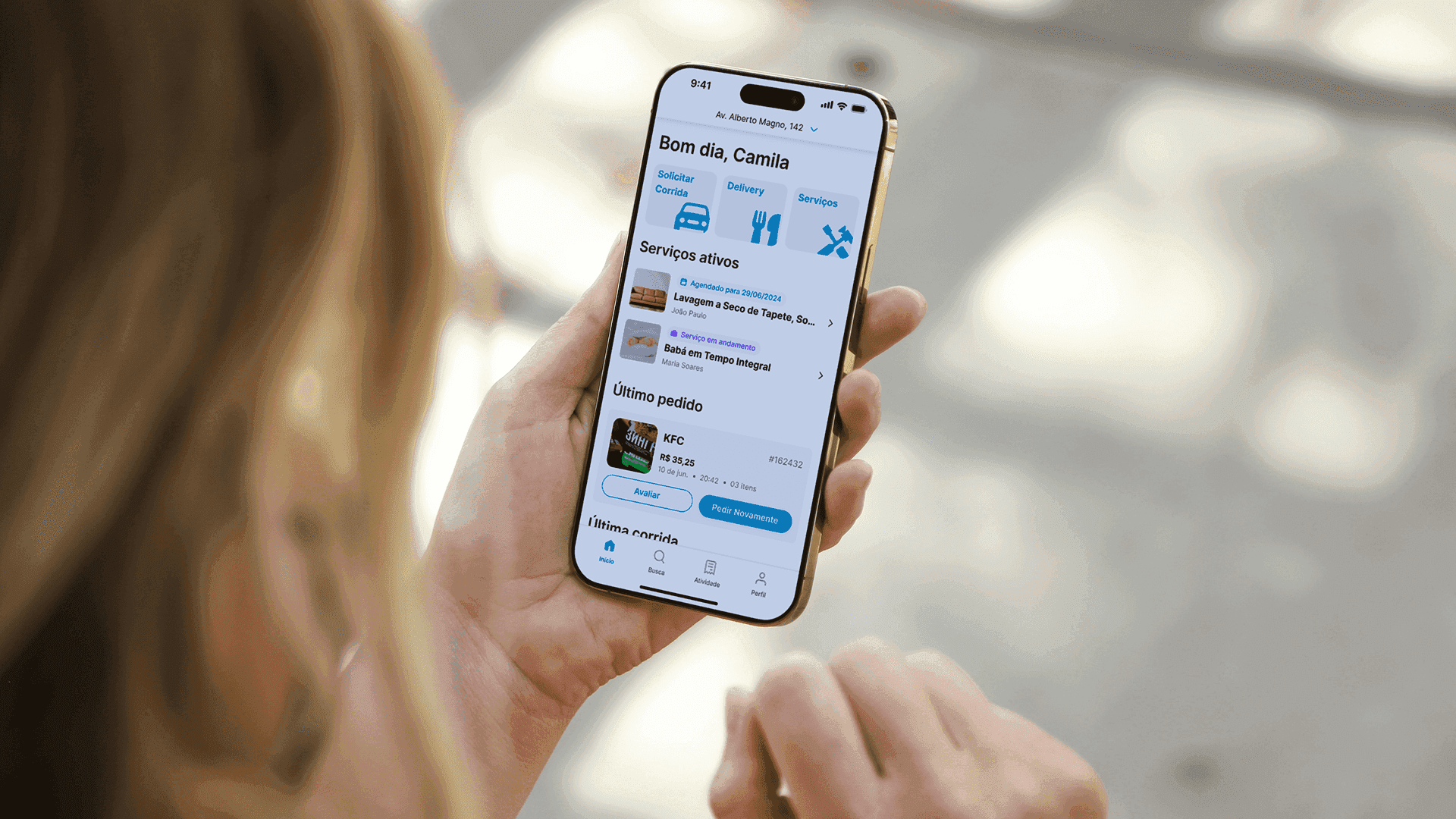
Mobility Pro, from 704 Apps, brought mobility, delivery, and on-demand services together in a white-label platform adaptable to each partner company’s visual identity. A true super app.
The challenge was to design for multiple journeys, keep flow between service types, and build a design system strong enough to support every interface—with room for future customizations. Below I share how I led the process from concept to delivery.
Understanding the proposition: a customizable super app
The initial brief indicated that Mobility Pro would be an evolution of the previous Mobility app. This time, however, it would be offered as a premium solution for companies that want their own mobility, delivery, or services app—with their brand, colors, typography, and tailored features.
In other words, beyond developing the default interface, the project needed a modular structure and adaptable design that allowed variations without compromising experience coherence.
I started with a deep review of references, benchmarks, and analysis of driver, courier, customer, and service-provider journeys. That initial immersion defined the foundations of the design system and information architecture.
The design system as the base for scale
To ensure visual consistency and ease of maintenance over time, I created a complete design system that served as the foundation for every app module. This included:
A neutral color palette with customizable accent points
Scalable typography for screens of different sizes
Reusable components such as buttons, cards, modals, and forms
Icons and illustrations with a clear communicative role
With that system in place, I could build each segment’s interfaces quickly while keeping visual unity across different contexts—from a courier’s screen to a customer looking for a plumber.
Interfaces designed for each audience
Mobility
The mobility module was split into two tracks: passenger and driver. For drivers, I designed a lean interface focused on essential information: active rides, navigation, communication with the passenger, and earnings summary. Usability and navigation flow were the priority.
Delivery
On the delivery side, the challenge was to design distinct experiences for consumers and couriers. For end users, I built screens that made it easy to discover restaurants, read reviews, and complete orders in few taps. For couriers, I kept logic similar to the driver experience: focus on routes, schedules, and order management.
Services
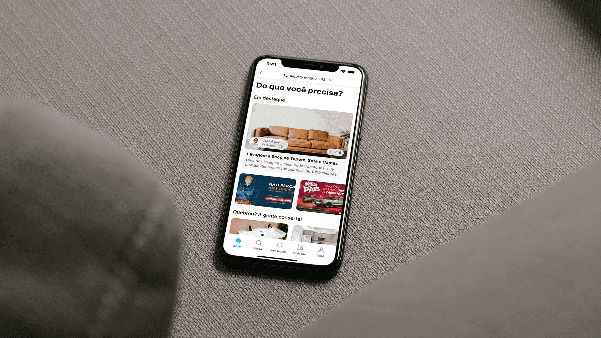
The on-demand services section required the most structuring. It lets users find professionals such as dog walkers, babysitters, plumbers, and more—with filters, ratings, and direct contact options. For providers, I designed a dedicated in-app panel with tools to create offers, manage services, and send proposals directly to clients—organized and transparent.
Final outcome
By the end of the project, we delivered more than an app: a white-label platform with a solid, flexible visual structure able to serve different market niches—with a focus on efficiency, customization, and a strong user experience.
Mobility Pro stands out by integrating multiple services in one app, with design that respects each journey’s specifics without sacrificing coherence. It was a challenging project and an extremely rewarding one to be part of—both for its complexity and for the impact it can have on companies and end users.