One of the major projects of 2025 was the birth of Stratto. Curiously, in the beginning that name did not even exist—what existed was an idea, a list of services, and a strong desire to grow.
When I received the challenge, the partners already had a clear vision of what they wanted to convey: a modern, serious, committed, and responsible brand. A consultancy that delivered excellence with innovation, one that felt both young and experienced. That balance was the heart of our process.
How the process began
Before talking about branding, we talked about people. We started by diving into the founders’ story: how they met, why they decided to build a business together, what success looked like to them, and what financial goals drove them.
That active listening was essential to understand what the brand needed to represent. More than visual identity or a name, Stratto had to carry real values and intentions.
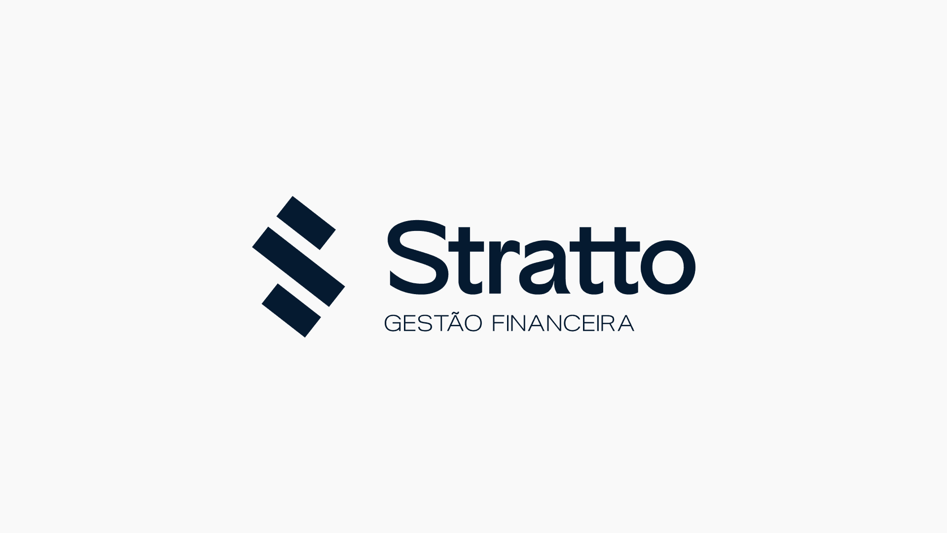
The name
Choosing the name was a chapter of its own. We knew common Portuguese names were already saturated or trademarked. Greek or Latin names sounded sophisticated, but felt distant from the brand’s actual proposition.
After extensive research and sound testing, we arrived at Stratto, an Italian-origin name derived from "strato", which in Portuguese means “layer” or “stratum”.
But beyond the literal meaning, Stratto evokes structure, a solid foundation, and well-built planning—exactly what the company set out to offer: a consultancy that acts as a financial backbone for businesses that want to grow with consistency.
The name also carries a strong, modern sound. It is not obvious, but it is memorable. It does not shout innovation, yet it communicates sophistication with confidence. The double “T” suggests stability. The final “O” closes with authority.
Market research and strategic definition
With the name defined, the next step was to dive into competitive research. We studied other financial consultancies and BPO companies, mapping their strengths, weaknesses, messages, promises, and visual positioning. That analysis was essential to understand where Stratto could stand out and how to avoid the same market clichés.
That is when we began building the brand’s communication on clear intentions—not only to differentiate, but to reflect what the company truly wanted to convey: credibility, modernity, closeness, and a focus on real results.
Brand manifesto
Growing with security is not optional—it is necessary.
Stratto believes that efficient financial management is the foundation for any company to thrive. In the day-to-day of business, where every decision matters, we offer solutions that combine technology, reliability, and agility to ensure control, stability, and growth.
More than organizing numbers, we deliver results. We act as strategic partners, simplifying processes and making financial management accessible, clear, and effective.
The manifesto is the soul of the brand. It expresses why Stratto exists, the impact it wants to create, and the kind of relationship it wants to build with clients. It also supports every future campaign, narrative, and promise.
Slogan
“Trust and efficiency for your business growth.”
Stratto’s slogan was designed to summarize its value proposition.
Trust, because no one hands over their finances to a company they do not trust.
Efficiency, because time and money go hand in hand, and optimizing processes is what delivers results.
Growth, because that is the real goal of anyone seeking financial support.
More than a catchy phrase, the slogan works as a strategic compass: it guides language, services, and brand decisions.

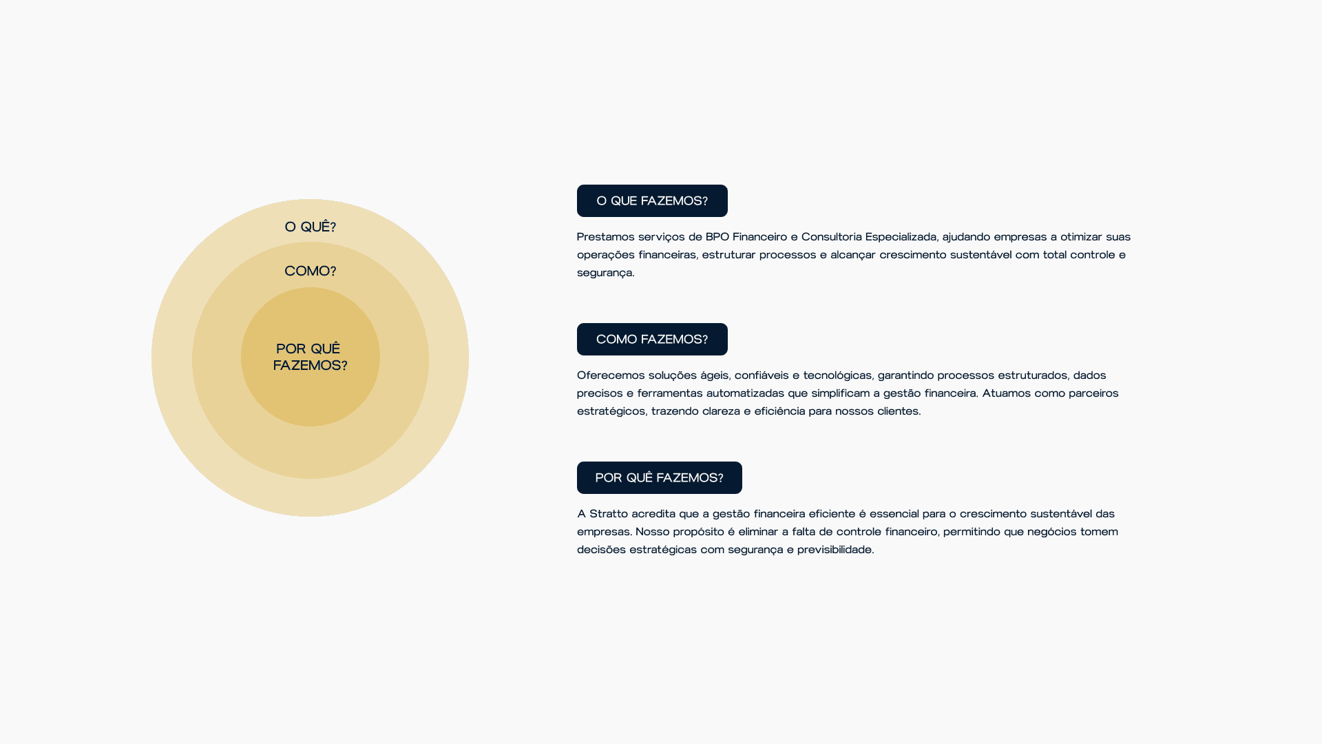
Inside-out brand strategy
Beyond the manifesto and slogan, we used tools such as the Golden Circle, definition of brand personality, keywords, audience type, and verbal identity. All of this ensured communication stayed coherent and intentional at every touchpoint.
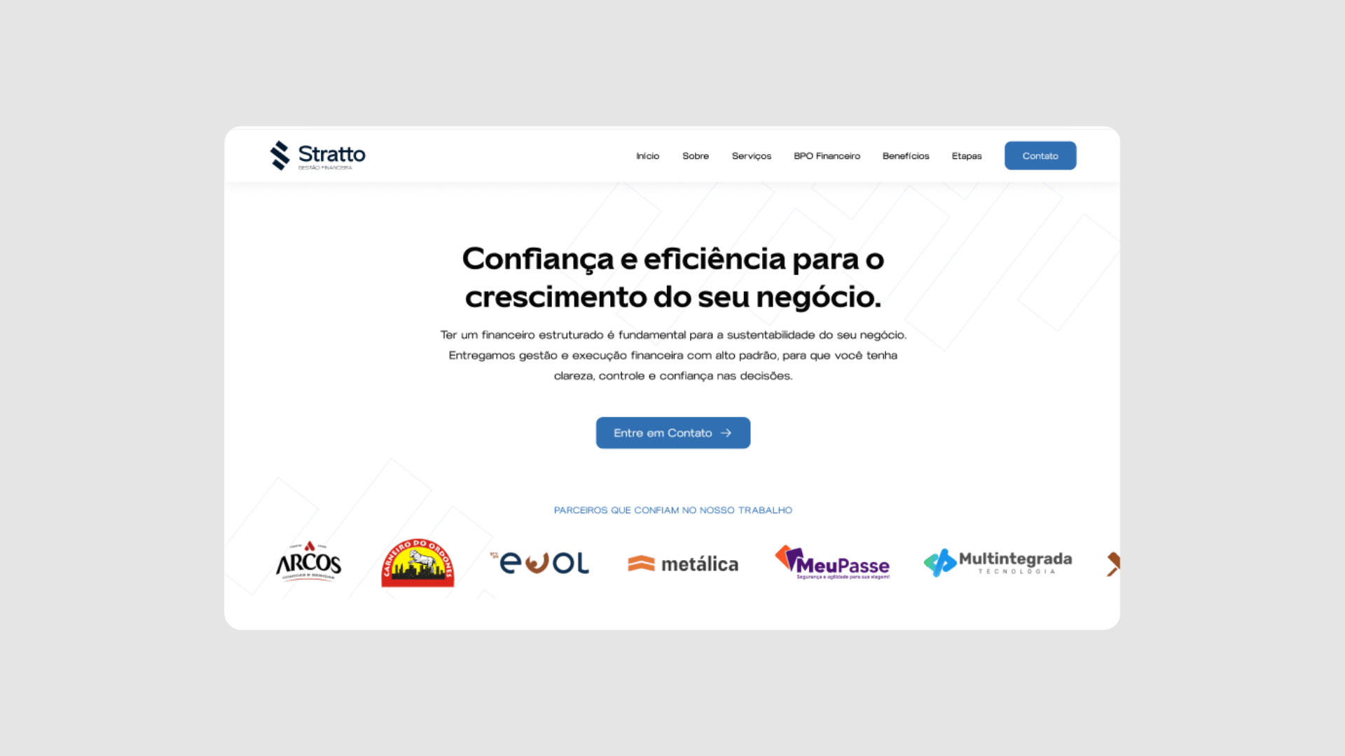
Visual identity
With those strategic pillars defined, we moved on to building the brand visually.
The choice of blue tones came from their association with trust, stability, and credibility—fundamental elements in the financial world. We opted for blue variations that also brought freshness and modernity, moving away from cold, rigid corporate blue.
The typefaces followed the same principle: clean, geometric forms with excellent legibility, conveying professionalism and agility. No overly traditional serifs or decorative styles—we wanted a visual identity that felt light, direct, and robust.

Conclusion
Creating Stratto was more than building a beautiful brand—it was aligning strategy, identity, and narrative so everything made sense inside and out.
Today, Stratto is born with well-defined foundations, ready to grow, attract the right clients, and create real impact for the businesses it serves.